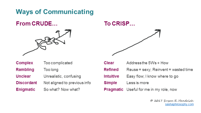
Whether creating a slide deck, preparing a presentation, or pitching a new idea to the boss, make sure your communication is CRISP…
The art and science of online learning.
Whether creating a slide deck, preparing a presentation, or pitching a new idea to the boss, make sure your communication is CRISP…
So many “micro-moments” in a day…
I want-to-know moments, I want-to-go moments, I want-to-do moments, and I want-to-buy moments.
These are the decision moments that consumers encounter throughout the day when they experience a want or perceive a need for themselves.
Think with Google writer Sridhar Ramaswamy says,
Today’s battle for hearts, minds, and dollars is won (or lost) in micro-moments—intent-driven moments of decision-making and preference-shaping that occur throughout the entire consumer journey.
For example, you check into your hotel in an unfamiliar town, and you’re hungry. You don’t know what’s available, but you’re looking out the window and you notice a “restaurant open” sign. You wonder what they serve, and if it’s any good. Suddenly, you turn your head and notice that there’s a brochure on your hotel nightstand with that restaurant’s menu, which proudly mentions of its five-star rating on TripAdvisor. You’re a consumer. You’re hungry. And this is a decision moment. Guess what you’re doing for dinner!
These micro-moments can be game changers in the capability-building world, too.
Think about it. Learners are consumers, too. And learners have countless decision moments…I-want-to-understand moments, I-want-to-know-how moments, that drive their choice to engage, or not, with your content. How can you design and deliver your content so that it’s available at the point of need—the precious micro-moments when your learners are ready and looking?
Read more about micro-moments in the Wall Street Journal and stay up-to-date on the latest insights and research at thinkwithgoogle.com/micromoments.
_________________________
YOUR TURN!
Please share comments with your ideas for saving time and energy.

During two decades of leading teams toward extraordinary results in health care, pharmaceutical, arts & cultural, university and military organizations, Susan Hendrich has always been inspired by the stories of people achieving uncommon results through perseverence, positivity and prying opportunity from challenge. Susan’s mantra is “ganbatte kudasai,“ which means, “Always try your best.”
頑張ってください
The ingenious (and totally fictitious) “Turbo Encabulator” video has long been used to warn against the use of technobabble. It has a fascinating history, which includes this Oscar-worthy 1977 performance by Bud Haggart:
Avoid confusing jargon in your presentations.
Be conscious of your audience and sensitive to their familiarity with the terms that you use. We should use jargon, acronyms and other technical terms only if we are sure that our audience will understand them. If there is the slightest chance that they won’t understand, then simplify your language. Remember, if they can’t understand your message, they can’t adopt it.
I know what you’re thinking…
“But, Susan, big words make me sound more interesting and credible!”
Actually, the opposite is often true. The more clearly and simply you can deliver your message, the more likely people are to follow your ideas (intentional double entendre).
I would write more, but I’ve gotta go for now, as my flux capacitor needs recharging.
Where have you seen (or even used) technobabble?
__________________________
Thanks to my colleague, Dave Ilconich, for reminding me of this classic video.
 Let your ideas breathe…
Objects in a composition need to breathe. White space offers an airy canvas stage on which the parts of your design can freely dance. Just ask Mark Boulton, graphic designer and writer from the UK. Here’s my favorite part about Mark’s view on white space:
“Whitespace is often used to create a balanced, harmonious layout. One that just “feels” right. It can also take the reader on a journey through the design in the same way a photographer leaves “looking room” in a portrait shot by positioning the subject off the center of the frame and having them looking into the remaining space.”
Check out this slide show by Brand Autopsy to see some compelling use of white space.
Now, how can you use white space in your next design, web page, slide deck or thank you note to make a bold statement?
Looking forward to [the spaces between] your ideas,
Susan Hendrich
The term Infographic is a portmanteau of two terms, “Information” and “Graphics,” and describes the visual representation of data. Infographics help communicate complex information in a digestible manner, as they creatively present data in an understandable and engaging format.
 As web users, with our diminishing attention spans, we’re inexorably drawn to these shiny, brightly colored messages with small, relevant, clearly-displayed nuggets of information. They’re straight to the point, usually factually interesting and often give you a wake-up call as to what those statistics really mean. Here are some examples to fire up your i-graph engines…
Intel’s “What About Me?”
Intel’s What About Me? is an automatic infographic generator that connects to your own Twitter, Facebook and YouTube accounts to create a profile infographic about you.
Social media users know that discovery is half the fun. With What about Me? you can capture a snapshot of your social media life and create your own colorful image, full of clues and facts about one of the most fascinating subjects in the world — YOU!
The chipmaker’s new “What About Me?” app culls info from your Facebook, Twitter and YouTube profiles to crank out a data visualization of your composite social media profile.
For instance, there’s a graphic that looks like a flower that tracks your interests based on what you tweet and write status updates about. There’s also a record of your most popular post ever and your most popular pic, your ratio of self-created updates vs. found information and “likes.”
Hohli is an intuitive, simple online chart maker. It’s incredibly easy to pick your chart type, add some data, vary the sizes and colors and see the finished chart.

Creately lets you design easy-to-make diagrams and flow charts. You can choose from a number of purpose-designed diagram types and quickly add your data to make your own chart. The end result looks very professional.

New York Times’ Visualization Lab lets you use statistics from recent NYTimes articles to create visualizations in various formats. You can also see other people’s visualizations and see how other people choose to display the same data.

Many Eyes lets you upload your own data or use data already stored on the site. The visualizations themselves are well-designed and very professional-looking. This is definitely the easiest way to use your own data for online visualizations.

Google Public Data lets you easily take public data and transform it into an infographic of your choice. These beautiful, colorful graphics simplify and communicate the data perfectly.

You may have seen my earlier post on Wordle, which lets you create word visualizations using text you enter. There are plenty of interesting designs to choose from. Enter whole books, short passages or see what other people have used. In this example, we can see the US constitution visualised.

Tableau is a free Windows-only software for creating visualizations. As you can see, these impressive graphs are colorful and quite unique.

