Future-Proof Your Career: Core Skills You Need for 2030

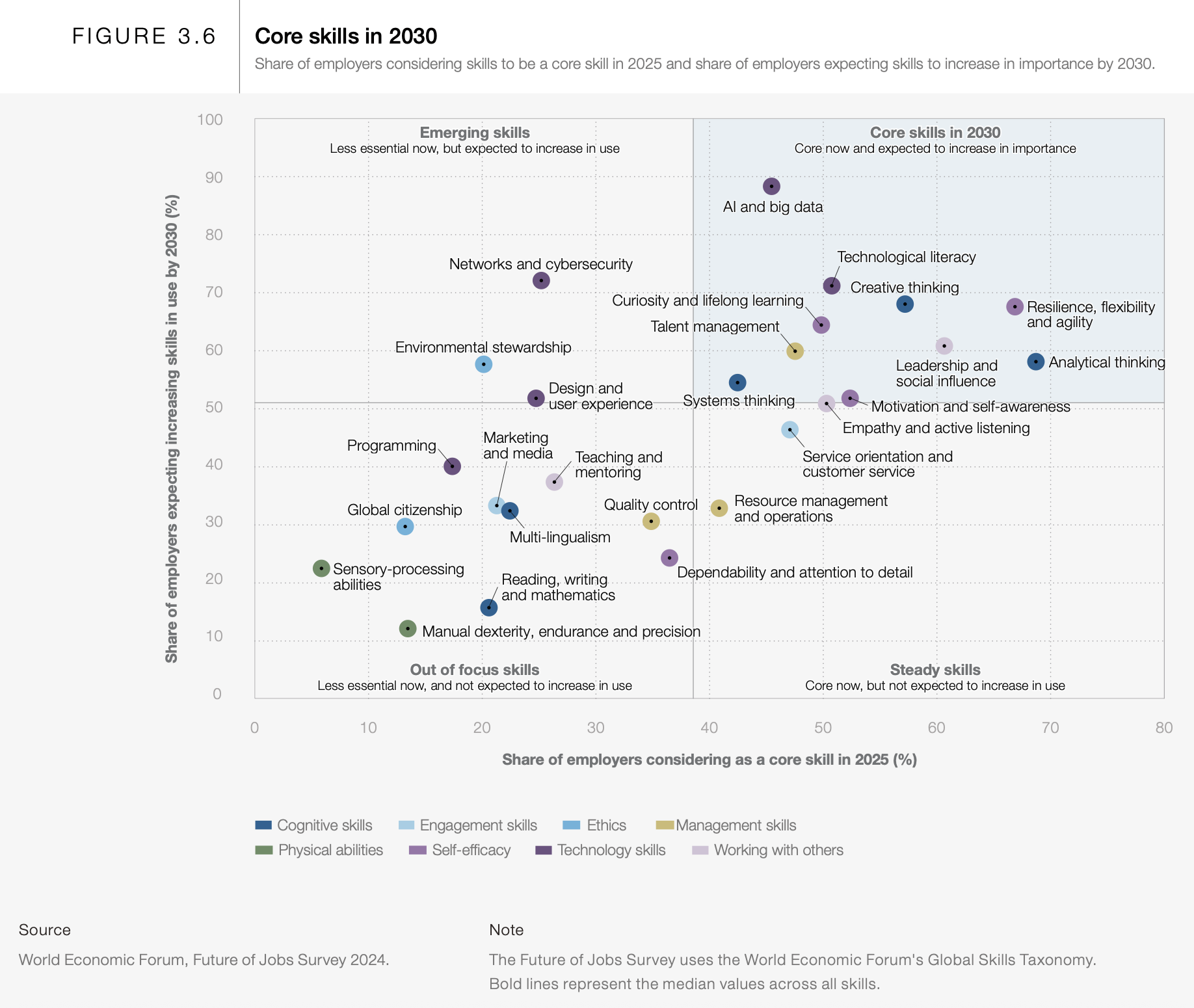
What skills will you need to succeed five years from now? The future of work is rapidly evolving, and the World Economic Forum’s Future of Jobs Report 2025 highlights the crucial skills we need to thrive in 2030. According to the report, analytical thinking is the most sought-after skill, with 7 out of 10 companies considering it essential in 2025. But it doesn’t stop there. Resilience, flexibility, agility, leadership, and social influence are also crucial. What about Artificial Intelligence (AI) and big data? Yup, it’s no surprise that these elements of technological literacy will be in high demand. But among my favorites are creative thinking, curiosity, and lifelong learning, along with motivation and self-awareness. These are skills we can build today!

Let’s explore some of the top skills you’ll need to succeed:

  • Analytical Thinking: Sharpen your ability to evaluate information, solve complex problems, and make data-driven decisions.
  • Resilience, Flexibility, and Agility: Embrace change, adapt quickly to new situations, and bounce back from setbacks.
  • Leadership and Social Influence: Inspire and motivate others, communicate effectively, and build strong relationships.

These aren’t just buzzwords; they’re the keys to unlocking future opportunities. Invest in developing these skills today, and you’ll be well-prepared to navigate the changing landscape of work and achieve your career goals. Where can you go to learn? Try LinkedIn Learning.

#FutureofWork #Skills2030 #CareerDevelopment #WorldEconomicForum

Want to read on? Check out the Future of Jobs Report 2025

Thanks for joining me. Let’s keep the conversation going. Our future depends on it.

Join the Leadership | Learning | Innovation conversation at sashaphilosophy.com.

Communicating data with Infographics

Infographics: Pictures That Tell A Story…

What is an Infographic?

The term Infographic is a portmanteau of two terms, “Information” and “Graphics,” and describes the visual representation of data. Infographics help communicate complex information in a digestible manner, as they creatively present data in an understandable and engaging format.

from www.DesignModo.comAs web users, with our diminishing attention spans, we’re inexorably drawn to these shiny, brightly colored messages with small, relevant, clearly-displayed nuggets of information. They’re straight to the point, usually factually interesting and often give you a wake-up call as to what those statistics really mean.  Here are some examples to fire up your i-graph engines…

Example: An Infographic that’s all about YOU

Intel’s “What About Me?”

Intel’s What About Me? is an automatic infographic generator that connects to your own Twitter, Facebook and YouTube accounts to create a profile infographic about you.

Social media users know that discovery is half the fun. With What about Me? you can capture a snapshot of your social media life and create your own colorful image, full of clues and facts about one of the most fascinating subjects in the world — YOU!

The chipmaker’s new “What About Me?” app culls info from your Facebook, Twitter and YouTube profiles to crank out a data visualization of your composite social media profile.

For instance, there’s a graphic that looks like a flower that tracks your interests based on what you tweet and write status updates about. There’s also a record of your most popular post ever and your most popular pic, your ratio of self-created updates vs. found information and “likes.”

More great Infographic examples

Free Online Tools For Creating Infographics

  • Hohli

    Hohli is an intuitive, simple online chart maker. It’s incredibly easy to pick your chart type, add some data, vary the sizes and colors and see the finished chart.

    information graphics

    Creately

    Creately lets you design easy-to-make diagrams and flow charts. You can choose from a number of purpose-designed diagram types and quickly add your data to make your own chart. The end result looks very professional.

    information graphics

    New York Times

    New York Times’ Visualization Lab lets you use statistics from recent NYTimes articles to create visualizations in various formats. You can also see other people’s visualizations and see how other people choose to display the same data.

    data graphics

    Many Eyes

    Many Eyes lets you upload your own data or use data already stored on the site. The visualizations themselves are well-designed and very professional-looking. This is definitely the easiest way to use your own data for online visualizations.

    data graphics

    Google Public Data

    Google Public Data lets you easily take public data and transform it into an infographic of your choice. These beautiful, colorful graphics simplify and communicate the data perfectly.

    data graphics

    Wordle

    You may have seen my earlier post on Wordle, which lets you create word visualizations using text you enter. There are plenty of interesting designs to choose from. Enter whole books, short passages or see what other people have used. In this example, we can see the US constitution visualised.

    Free Software For Creating Infographics

    Tableau

    Tableau is a free Windows-only software for creating visualizations. As you can see, these impressive graphs are colorful and quite unique.

Great tutorials on infographic creation: